
Understanding User Challenges
The analysis of the current flows and functions shows several problems for users. The design is inconsistent, navigation is unclear and the information structure is confusing. Important features like search and recommendations are hard to find or understand. In addition, some functions are missing or not clearly explained which makes the product harder to use and less intuitive.
Designing a seamless experience
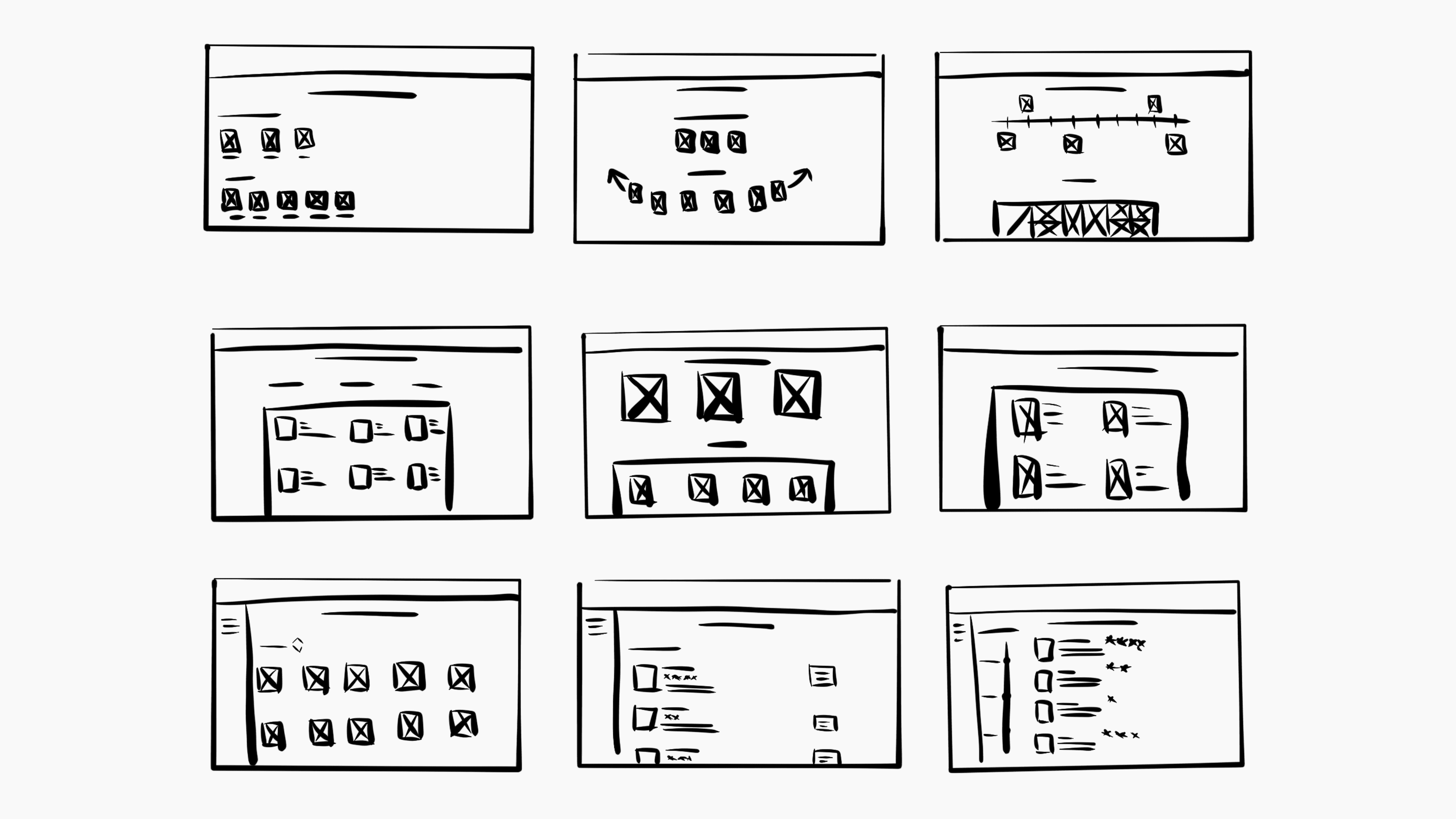
Through a collaborative design studio, we explored multiple solution approaches using rapid sketching, feedback, and iteration. Starting from low-fidelity sketches, ideas evolved into device-based and digital wireframes. The team aligned on a shared concept and refined it together through structured feedback loops. Information architecture was defined using card sorting to reflect users’ mental models. The result is a clear, intuitive, and exploratory user flow for an improved Goodreads experience.
We developed a complete redesign of goodreads as a website with a clear focus on UX and UI. Users can easily track reading progress, discover trends, news, and new releases. Book inspiration is available through the homepage and detailed book pages. Interactive grid and list views create an intuitive and engaging browsing experience. The screen flow remains familiar while feeling more structured and modern.
For typography, we chose Bennet Banner for headlines and the logo, combining character with readability. Its serif style adds editorial quality while working well in digital environments. The color palette centers around a dark green, representing calm, stability, and tradition. Lighter green accents highlight key actions subtly and naturally. Warm orange tones add energy and warmth, drawing attention without overwhelming the interface.
